I've worked on a ton of road signs lately
long story short, I've decided to make new files for each one of my current standards to give them some sort of fresh start
not an entirely fresh start, of course
I'm taking inspiration from each standard's entire history
that means, for example, taking the original Shedington the 5th signs from november 2021 into consideration, and not just their latest renditions
so, here is an overview of aaaall that I have made in these new files, kind of in alphabetical order:
Terra Fictitia
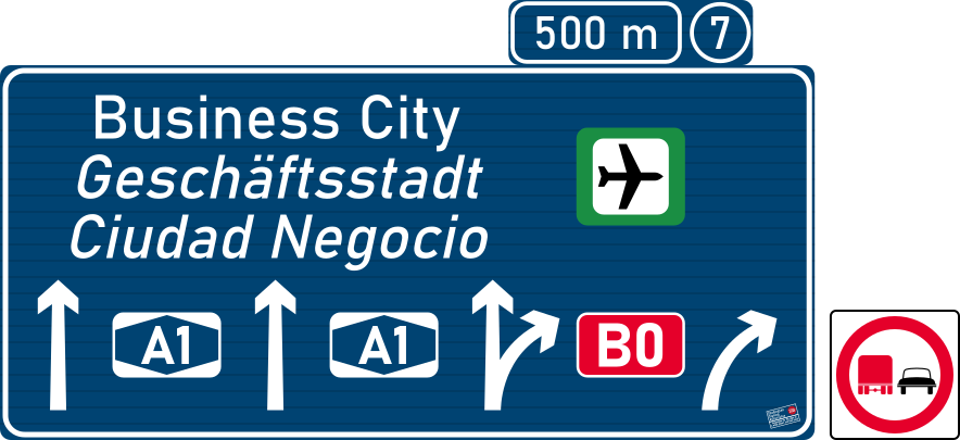
Businessland
who would've figured that an anarchocapitalist country could have such sweet road signs?
from the universally known Bahnschrift to the custom arrows and pictograms, these signs are sure to make you invested in them!
but all jokes aside, I'm very happy with these signs, I like the idea of making my own pictograms for this country, but at the same time, I shudder at how much effort that will take lol
the biggest change when moving on from the old to the new file was the slats
Businessland signage had slats before the update, but they were simply cosmetic. as in, they didn't modify how tall the sign actually was, they were only evenly spaced across the sign
and it's good that they didn't determine the sign's height, because each slat was 50cm tall
now, slats are 15cm tall and they do determine the height of the sign. its width is also set to the nearest multiple of 15
1px = 1cm
ISD (Pentford)
just an update to the new file, no modifications done
1px = 1cm
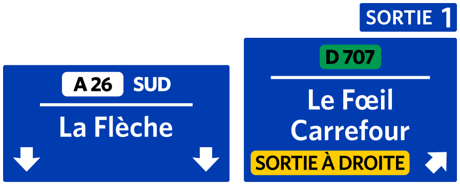
ISD (Shedington)
one cool thing that I decided to bring back from the old Shedington standards is the white box around the cardinal direction
I also did a few different designs for the Shedington the 6th advance exit sign, the top image of the two, and what you see ended up being the final result
1px = 1cm
Project Midnight
Beiyan
not much here, just the advance signs were done
country uses Barlow for its text
1px = 1cm
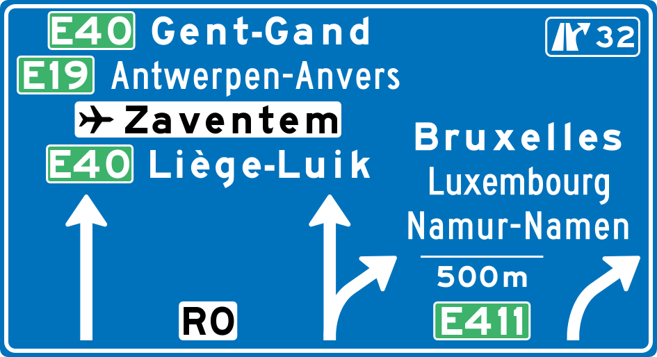
Benelux
I haven't worked on this in a while, but the stuff that I got down was rather expansive I believe
the first thing I did was take the three combined countries and create regions for numbering the national routes
after that I stated that nine main national routes exist: N1 thru N7 radiate from Brussels, N8 follows the french border and N9 follows the german border
two digit national routes radiate from the main city in each of the nine regions. for example, in region 2, routes N21 thru N29 radiate from Ghent. N20 isn't allowed to prevent conflict with N2 three digit national routes are spurs of either one or two digit national routes, they are labelled as their parent route plus a number
for example, route N307 is a spur of N3 and N218 is a spur of N21 I never decided to sit down and write aaaaall national routes of Benelux... and I don't think I ever will lol
1px = 1cm
Lenara
no intention to reinvent the wheel here, I only want to recreate the original signs as faithfully as I can, and then expand upon them
fonts are the LLM typefaces
1px = 1cm
Lignareix
just like Lenara, the goal is to simply recreate the signs. the few ones that exist, anyway
finding the typeface used by these standards was pretty interesting. I had to use a couple of online tools to recognize the font
1px = 1cm
Navarra
not much done here, just exit advance signage for both periods of time (before and after 2007)
font used is Ruta CL, originally from Chile
1px = 1cm
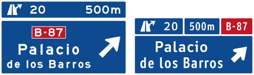
Norbotten
again, only exit advance signage done for this country. it uses kinda-APL signs for lane drop exits
font used is Traffikalfabet, the norwegian font
1px = 1cm
Patria
the country has recently ended a long civil war, and now almost all of its infrastructure needs to be redone
this means that their signage got a makeover too! although it's all original by me, sooo
1px = 1cm
Other
Dystopian
the original signs used AES Ministry and Caracteres L4, for some reason
it also uses a texture that I found online with colours on top of it, instead of a single colour
I put the arrow and motorway symbol over a grid to trace and refine them
I also decided to split these standards into two time periods, with each getting its own fonts
the older period uses AES Ministry like the old one did, but ditching Caracteres L4 entirely
meanwhile, the newer period uses Ministry (designed by Rian Hughes) because it's close to AES Ministry but also has lowercase letters
I made the background a flat colour, rounded the border and gave a little border of colour between the white border and the edge of the sign
I also added black lines to symbolize slats. because slats are cool
the slats are 15cm tall, forcing the height of the sign to be a multiple of 15
because of that, I decided to force the width of the sign to be a multiple of 5
no exit numbers on display, and a big preference for districts over street names as indications for signs
1px = 1cm
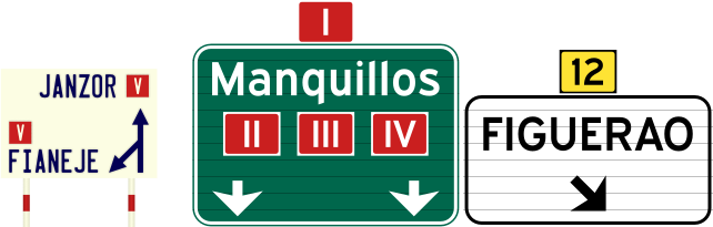
Manquillos
this sign project might be a bit more than I can chew to be honest
my intention is to make three different time periods for the signs of this country
but it's not just guide signage, oh no... it's everything ...jeez, I need to update that page AGAIN. ughh...
that page is like the tale of sisyphus I swear
but anyway, uh, fonts
Manquillos the 1st uses License Plate, Manquillos the 2nd uses Caracteres L3, and Manquillos the 3rd uses Expressway
Expressway is a font inspired by the notorious FHWA (Highway Gothic), so it's got a bit of familiarity but also some funkiness to it
another thing that I like I did was give some prevalence to roman numbers
right now it's only on speed limits, but I intend for the main 7 highways to use them
wait, why don't I just change it right now lol
done
Manquillos the 3rd also uses 15cm tall slats
also I can't show a sample for Manquillos the 2nd because I haven't done any yet, oops
oh and the poles for signs are coloured
I might as well mention that I'm going to draw a TON of inspiration from the spanish 1939 and 1962 sign standards, but trail off without a guide for the Manquillos the 3rd signage
1px = 1cm
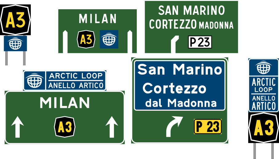
Minecraft
oh yeah, these have changed a lot lol
so, there originally were three time periods for Minecraft
first time period used Caracteres L2, second used FHWA Series EEM (unofficial font in the Roadgeek 2014 font collection) and third time period used Transport Heavy
secondary routes used rectangular shields while national highways, and later freeways, used hexagonal shields
I must say, I am still very happy with them, but I didn't feel like there was a huge difference between the second and third time periods
so in the first revamp, I got rid of it
I also replaced the original Transport Heavy for the danish modification of transport, and using the Heavy and Medium versions accordingly unlike before
aaand! I also introduced LLM Narrow for things like hectometer signs, cardinal directions next to route shields, service signs... I can't recall more right now lol
I also established a numbering system for the routes that I'm still pretty happy with
now, with the second revamp, I've brought back the in-between time period. yippeeee
Minecraft the First now uses AES Ministry, but I kinda wanna change it back to Caracteres
Minecraft the Second uses SAA Series C and EM. they're the original version of Highway Gothic that is still used in Australia
Minecraft the Third still uses the danish fonts
for what it's worth, here's a comparison between the original and the second revamp signs for each time period
the fonts in the original signs were actually a bit different but I've replaced the fonts for newer ones, and I'm not gonna install the old fonts again
also, completely dismissing the first revamp on purpose, I don't feel like making the signs in that style, these are close enough anyway
1px = 4cm, open image in new tab for 1px = 1cm scale
Poland
I think this came thru because, at first, a friend from Poland suggested me to remake a sign
he gave me the links to the standard documents, and looking through them I told myself "jeez, these are awful! I should make my own!"
and the last couple of days, I actually went ahead and made my own lmao
not much to say here. I'm keeping things pretty based on the document and real life signs, but adding some details of my own
1px = 1cm
Rocker Isle
nothing really new to see here, just the fact that the arrows in advance exit signs are now angled 30º and at exit signs their angle is 45º as it always was
1px = 1cm
Spain
since these are the standards that I know besst, they're the ones with which I've taken the biggest amount of creative freedom
the first thing I did when I began redesigning spanish signs was bring back the Autopista typeface, the derivative of Highway Gothic used only on freeways
I also brought back the blue legend, white background colour scheme used for autovías up until not that long ago, but I decided to forget about vías rápidas
aside from that, I also put the road number outside and above the road sign itself, like Cataluña and France do. or well, like we do nowadays with E-routes
and also, AIMPE signage, pretty much untouched except I decided to give hospitals white legend and red background to make them stand out more
also, Spain in real life uses slats on its signs too, but I don't do it most of the time because going that extra step is pretty boring to me lol
the slats that we use in real life are 17.5cm tall instead of the 15cm I use in other standards, sooo that makes the numbers a bit less nice to work with too
1px = 1cm
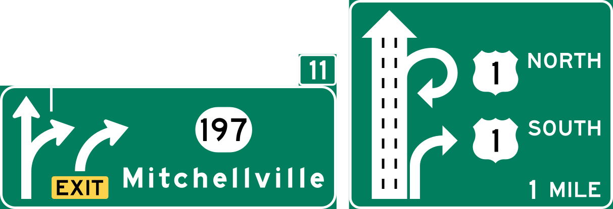
United States
I don't use this template too much because everyone I know already makes sign based in the US, but recently I went on a frenzy scouring for research on advance exit signage
it all started when a while ago I bumped into a pdf from Texas where they showed many different designs of advance exit signs to drivers
they had them say what lane or lanes they would pick to either take the exit or remain on the highway
it studied the effectiveness between conventional, diagrammatic and arrow-per-lane signage, and I found it very cool
so I decided to dig more into it
that's how I came across a document where they had swapped many conventional signs for diagrammatic signs in New Jersey
I really liked it and decided to do some diagrammatic signs of my own
but yeah, besides that, I also made a sort of APL sign that looks like Ontario's, to be used for minor exits, and I think it's pretty nice
1px = 1cm
Workers and Resources: Soviet Republic
it's a city building, country management game, but it also has roads and cars, so I like to use it to set up a car on a route and have it drive around lol
its signs are based on old czechoslovak signs, and it uses the East Germany font (Gill Sans)
the background is taken from a mod for the game that adds overhead signs, and I found the way to add custom signs by modifying the blank texture
I don't think I'm actually going to add any signs because of how the interface works, but one can dream
there are two variations of these signs, ones where the background is locked to the original texture, and ones where the background size is proportional to the original texture
1px = 1cm